Choosing Blind Colours: Simple Guide 2026
Choosing blind colours can feel overwhelming when you balance swatches, light, and materials. This guide makes the process clear so your home reflects you and works with South African light.
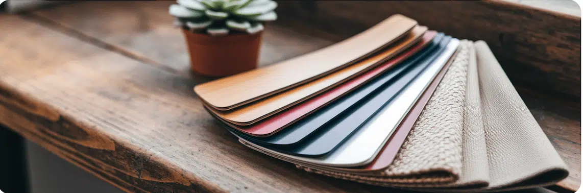
What are the foundations of blind colour choice in a South African setting?
The South African sun changes how colour reads in a room. Highveld light can sharpen and brighten tones. Coastal light can soften the same hue. Always test samples in the actual room through the day.
For 2026 and 2026 many homes lean into earthy palettes. Salvocorp highlights tones such as terracotta, sage green, and sandy beige. Warm colours energise living spaces. Cool colours calm private rooms. Blinds can be a quiet base or a bold accent. Explore our indoor products to shape the effect.
How do you match blind colours to your home’s architectural style?
Let the architecture guide your palette. The right blind colour should feel like part of the building.
Modern and Minimalist Homes
Clean lines suit crisp white, charcoal, and black. Aluminium Venetians reinforce a refined look.
Traditional or Heritage Homes
Choose deep woods, creamy whites, and muted tones that respect original floors and mouldings. See our wooden blinds.
Coastal and Farmhouse Style
Soft white, light grey, and pale blue keep rooms bright and relaxed. Light wood finishes echo the landscape.
Eclectic or Bohemian Spaces
Use jewel tones such as emerald and sapphire or warm colours such as rust and mustard to link diverse pieces.
Which blind colours work best room by room?
Match colour to function for harmony and performance.
Living Room
Greige, soft grey, and beige adapt to seasonal styling. Light filtering rollers reduce glare while keeping daylight.
Bedroom
Soft blue, muted green, and earthy brown support rest. Blockout rollers in navy or charcoal support sleep. Duo roller gives flexible control.
Kitchen and Bathroom
Bright white or light grey reads clean. Synthetic Venetians and aluminium resist moisture.
Outdoor Braai Area
Charcoal, sand, and green blend with the garden. Outdoor weather blinds manage heat and glare.
| Room | Primary Goal | Recommended Palettes | Suggested Blind Type |
|---|---|---|---|
| Living Room | Versatility and glare control | Greige, soft grey, warm beige | Light filtering rollers, wooden venetians |
| Bedroom | Rest and privacy | Soft blue, muted green, earthy brown | Blockout rollers, duo roller for flexibility |
| Kitchen and Bath | Durability and hygiene | White, light grey, black | Aluminium or Synthetic Venetians |
| Outdoor Braai | Glare reduction and durability | Charcoal, sand, forest green | Outdoor screens |
How do texture and functionality affect blind colour choice?
Texture changes how colour feels. Wood adds warmth. Aluminium looks precise and reflective. Woven fabrics soften light and sound.
Blockout performance comes from the lining. You can choose light colours and still achieve full darkness. For design ideas visit Dezeen and our blog.
How do regional South African palettes influence blind colour choices?
- Western Cape: Fynbos greens, ocean blues, sandy neutrals suit indoor and outdoor living. See our indoor products.
- KwaZulu Natal: Tropical greens and bright whites thrive in humidity. Shutters manage heat and airflow.
- Gauteng and the Highveld: City polish meets earthy tones. As House and Garden shows, bold jewel tones remain strong.
- Karoo: Terracotta, stone grey, and white echo the landscape and help cooling.
How do you make a confident final blind colour choice?
Feeling overwhelmed is normal. We are here to guide each step so your blinds fit your life and your taste.
- Define the room purpose and mood.
- Match your home architecture.
- Test samples in real light at different times of day.
- Choose texture and fabric for performance and feel.
For fast ideas and pricing chat with Melvin or book a one on one consult.